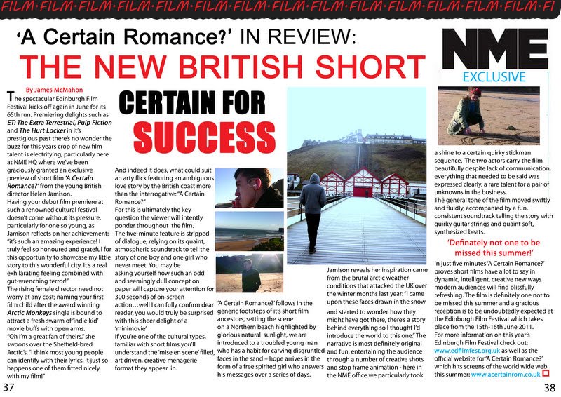
 Here, I have improved the house stlye to a striking yet edgy black and red to appeal to a wider audience. I have included real screen shots from the film to reveal more about the narrative, I think it looks more authentic and themed towards an NME arcticle with the logo. I've used a mixture of font sizes and colours for the headline, for a quirky effect that captures the attention of the reader. The style of the journalism is semi-formal with direct adress to the audience and istances of metaphors and humor to entertain the reader, yet explains the premise of the film clearly and cohesively. I think it works well as a review whilst giving extra information about the director as well as the Edinbrugh Film festival, provding links for where the film can be viewed as well as the premier date.
Tuesday, 1 March 2011
Article: Final Draft
Here, I have improved the house stlye to a striking yet edgy black and red to appeal to a wider audience. I have included real screen shots from the film to reveal more about the narrative, I think it looks more authentic and themed towards an NME arcticle with the logo. I've used a mixture of font sizes and colours for the headline, for a quirky effect that captures the attention of the reader. The style of the journalism is semi-formal with direct adress to the audience and istances of metaphors and humor to entertain the reader, yet explains the premise of the film clearly and cohesively. I think it works well as a review whilst giving extra information about the director as well as the Edinbrugh Film festival, provding links for where the film can be viewed as well as the premier date.
Subscribe to:
Comments (Atom)